Social Studies Data: Make ’em Graph It
A MiddleWeb Blog

This mathematical deficit can turn a helpful visual comparing the relative industrial outputs of the Union and Confederacy during the Civil War into a complicating factor that further obfuscates already complex historical events.
While I cannot claim to have completely mastered the art of making graphs comprehensible to all students, my students recently completed a comparison project that appears to have created a solid foundation on which I can continue to build throughout the school year.
Designing a survey

Organizing the data
After completing their surveys, student teams pooled the responses. The yes-or-no and multiple-choice questions simply needed to be counted. The open-ended questions, however, required more thought. After showing the whole class how teams might group their open-ended responses, I worked my way around the room to help individual teams accomplish this task. Usually, I encouraged teams to create no more than four categories of similar responses, with an “other” category for the outliers.
The most important part of this exercise is that students create categories that make sense to them, and that narrative responses are transformed into discrete, countable units.
Making the graphs
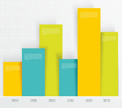
As the students were making their rough draft graphs, it became clear which teams understood the basic mathematical principles required to accurately represent data, and who needed help. I was able to target those teams whose graphs did not match the survey data they had collected. The misunderstandings varied from student to student, so the targeted approach was ideal with my population.
Some broader applications
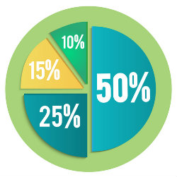
Even without the cross-curricular connections, I believe having the students create their own graphs from data they collected helped to make the whole notion of graph reading a little less abstract. As the year progresses, I will refer back to their graphs as we look at historical data, and my hope is that they are able to see the story behind the shaded rectangles and colored wedges.








Aaron I would like to get in touch