How Do We Teach about History’s Tragedies?
 For most of us, the school year had already ended before the tragic shooting at Emanuel African Methodist Episcopal Church in Charleston on June 17.
By the time school resumes in August, this will no longer be a current event by today’s news cycle standards, though it has a historical context that reaches back over 150 years and more.
Whether you are talking about a recent tragedy, or an ancient one, death is an unfortunate staple in history classes. The challenge for history teachers of middle school students is how to treat death sensitively.
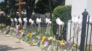
While some might argue it is not, I think most would agree that it is at least insensitive to teach about war, terrorism, disease and other human tragedies without paying attention to the emotional impact of such occurrences.
There are so many grim statistics. Consider just a few familiar ones:
- 6 million Jews died in the Holocaust, 5 million others
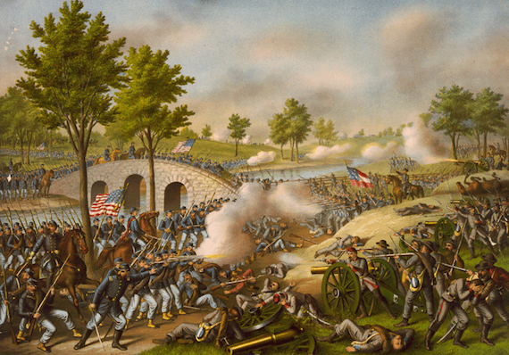
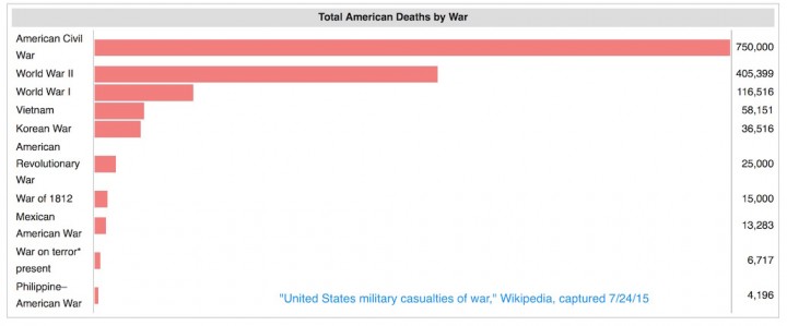
- 750,000 military-related deaths in the American Civil War
- 1.5 to 3 million Cambodians killed by the Khmer Rouge
We must ask ourselves, how can we help our students appreciate both the enormity of these statistics and the humanity of a single death?
Suggestion #1: Visualizing the Statistics
The first step in helping students comprehend such statistics is to present them in creative, comparative ways. For example, it is not easy to visualize what 6 million looks like. Students are, however, familiar with the concept of having a minute of silence for various things. Ask them to figure out how long a minute of silence would take for each of the six million Jews that died in the Holocaust. The answer—about 11 years—is devastating.
Or take the figures for Civil War military casualties. If you just tell students the number 750,000 (the estimate as revised in 2012), it will not have the same impact as if you depict it as in the graph below. Even then, you may have the student who, by noting that both sides in the Civil War were American, somehow makes the figure seem less dramatic. But then you can ask them to visualize it in other ways.
For example, they are likely familiar with the Vietnam War memorial or you can show a picture of it. Imagine how big a wall would need to be to display the names of all those who died in the Civil War.
Another way to compare images is by percentage of the population. During the Civil War, 2.4% of the population died. That number may not sound like much to your students, but if you compare it to World War II, which was about 0.3% for the United States, and then point out that if 2.4% of the U.S. population today was killed in a war, it would be about 7 million people, that will change their perception.
If you are teaching about World War II, comparing the military casualties of the U.S. to the Soviet Union is especially wrenching; the Soviet deaths were more than 20 times as great – at least 8.6 million. (Wikipedia has some excellent information on this.)
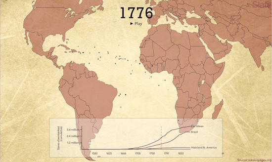
There are even more compelling possibilities that exist for visualizing data through interactive and animated graphics. See, for example, this interactive from Slate on the history of the Atlantic slave trade. You can find other examples that will suit your content needs by doing searches that use the terms “interactive,” “animation,” and “infographic,” along with the topic you wish to explore.
Suggestion #2: Make it “Human”
Once students have a good grasp of the enormity of a particular event, it is critical that we discuss the impact of such an event on an individual level. Statistics are powerful, but they do not offer the human perspective. For that, primary sources such as diaries, letters and memoirs are indispensible.
I have found no letter as emotionally poignant as the ones written by German soldiers before the fall at Stalingrad during World War II. (You can find them here.) But don’t overlook secondary sources, including poetry and literature as well as non-fiction.
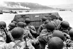
Those pages tell the story of a British lieutenant, Den Brotheridge, in a way that humanizes all the incredible statistics of D-Day.
It occurs to me, too, that while I have presented this as suggestion #2, it doesn’t have to be. Depending on the topic and the sources you have available, it might make more pedagogical sense to provide a single example of an individual first, before you get into the overall statistics of an event.
Suggestion #3: Set the Right Tone
Imagine you are about to teach a lesson on the Black Death. Your 6th period class bursts in after lunch, laughing and boisterous. How do you “set the mood” for the class in such a case? While I don’t have a pat answer for you, it is important to remember the messages we send through our tone of voice and body language as well as our curricular decisions.
The United States Holocaust Memorial Museum provides a very useful list of guidelines for teaching about the Holocaust, many of which are relevant to other topics where the learner’s state of mind is important.

The examples above, however, remind me of another key guideline provided by the US Holocaust Museum: avoid comparisons of pain. Comparisons can be useful. It is worth teaching students about the differences between slavery in North America compared to the institution in the Caribbean or Brazil. However, we must be cautious lest our students erroneously conclude that it was “not so bad” to be a slave in North America. To compare one tragedy to another can lead to conclusions that are insensitive at best and offensive at worst. And just wrong.
When you do make comparisons, do so in order to spark discussion or raise questions, rather than draw definitive conclusions.
For example, take the shooting of 26 students and teachers at Sandy Hook Elementary School in 2012. This powerful graphic from Huffington Post about gun deaths since then speaks volumes about guns in our society. Does it send the message that the 26 people who lost their lives at Sandy Hook are no more or less important than any of 2,244 people who lost their lives in the 98 days after that?
You don’t have to answer. Instead, ask your students. A sensitive discussion can mitigate the potential landmines implicit in the comparison.
And Don’t Forget Your Students’ Lives
A final thing to remember is the unique experiences of your students. Students with personal experiences of loss or some connection to victims may be more sensitive to discussions of tragedies than others. And it is, of course, possible that you might not even be aware of their experiences.
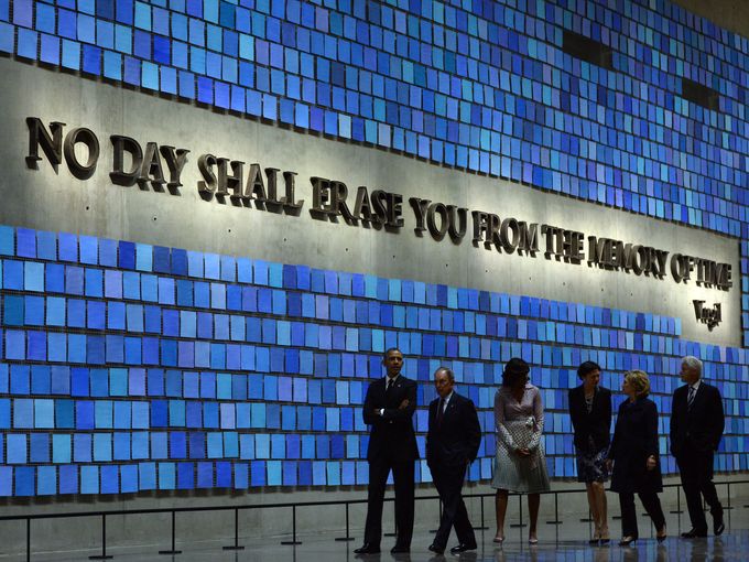
When preparing a lesson on the tragedy of 9/11 last year, I came across an essay that gave me pause. Written by the brother of one of the victims, it highlighted how the experience of visiting a museum or memorial (in this case, the 9/11 National Memorial Museum) is colored by one’s personal relationship to an event.
Check it out here. I have included some suggestions for questions. It might be useful if, come September, you spend a day or two on the events of 9/11. But they also raise the kind of overall questions we must keep in mind when teaching about matters of life…and death.
What strategies do you use to teach students about tragic events?









I also include the Sullivan Ballou letter when I present our Civil War unit. I like your ideas. I teach 6th grade U.S. history.
The letter from Sullivan Ballou is a great one! For anyone who doesn’t know about it, read more here: https://www.pbs.org/civilwar/war/ballou_letter.html. You can also see the lovely rendition of it done by Ken Burns on youtube. Thanks for the great suggestion.
Fantastic strategies! I’ve linked to this article from a post titled, “Selecting Primary Sources That Deal with Difficult Issues” (http://primarysourcenexus.org/2015/02/selecting-primary-sources-deal-difficult-issues/).
Thanks for the link you provided. It is a good article with useful suggestions. In the comments to that article, a reader provided another link with more great suggestions on sensitive topics. Find that here: http://www.americanjourneys.org/teachers/sensitive.html
Very nice! I’m teaching AP US History this fall and I’m so excited because this summer was ” the gift that kept on giving “. I am keenly aware, however, as an African American of the sensitive nature of the past while teaching in the present. Thank for your tips.
Thanks. I agree…so great to have such interesting issues to begin the school year, but more than a little awkward to be excited about others’ tragedies, isn’t it?
Data and history are close companions but we do not merge then nearly enough. Check out the free data sets at SAS Curriculum Pathways https://www.sascurriculumpathways.com/portal/Launch?id=3001
Thanks, Molly. This is a neat resource. Found a spreadsheet with the # of reps in the House per state over time.
The Mortality section of the “Statistical atlas of the United States, based upon the results of the eleventh census” published in 1898 includes very interesting statistics and graphics. It can be found on the Library of Congress website and can be viewed online, downloaded or printed. http://www.loc.gov/item/07019233/
The introduction at http://www.loc.gov/resource/g3701gm.gct00010/?sp=77 explains how the information was gathered. Tables show death rates by race in some cities and by certain diseases.
Page 79 at http://www.loc.gov/resource/g3701gm.gct00010/?sp=79 features maps representing numbers of deaths from diseases per 1000 deaths from known causes. The following pages offer more fascinating statistics and it is easy to spend way more time reading these than you intended…
What great fodder for a lesson! Yes, I often find myself getting lost in interesting data like this.
I wish more middle schools would take this information into account as they teach these young minds. Even one death- mummification of kings and such. This to be taught so realistically and the real images of these things have different effects on on different students.
Without a real discussion or debriefing of these lessons can leave an impressionable student scared and may even sour their thirst of knowledge of such things in the future.