Campaign Advertising: The Image Is Everything
 By Frank Baker
If there is one thing that will influence voters more than anything else during Campaign 2016, it is the image. That’s why huge sums of money are being spent to present the presidential candidates in the best possible light – with the best possible setting.
More than ever, what the voters see, not what they hear, has become paramount in getting elected.
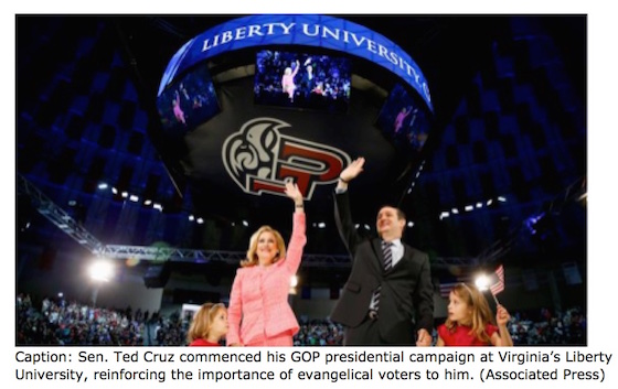
At MiddleWeb I have previously written about the “stagecraft” preparations—what is done in the months and weeks prior to a candidate’s appearance at a location. Advance people will have worked on everything from what the stage looks like to the composition of the audience standing behind the candidate, to where the photojournalists will be positioned.
The campaign consultants who do this work want to ensure that everything is in their control. (In the business it’s called poli-optics.)
Visual literacy, already a part of the Common Core ELA standards as well as the arts standards of most states, comes into play here. Can you and your students look at a photographic image and read what is happening? In these highly visual times, as we stare constantly at the screens of our digital devices, critical viewing skills are an important aspect of media literacy instruction.
From now until election day, news sources (newspapers, TV, blogs, social media) will be filled daily with images from both Republican and Democratic campaigns. As educators who want to help students better understand the reliance on visuals in politics, you have plenty of opportunities to pull these images in your classroom for healthy discussions.
Here Come the Commercials
Pundits are already predicting that the commercials from both sides of the political race (and their Super PACs) will be some of the most negative ever in the history of US politics.
Instead of concentrating on the commercial’s content, charges, allegations and mudslinging, I recommend that you instead have students consider the images.
Opposition research and past campaign history provide a rule book of sorts for how to manipulate video to influence unsuspecting, and media illiterate, voters. (Editor’s note: the following video has images that may not be appropriate for all students. The video is intended primarily for teacher PD.)
In a new video series, Now You See It, producer and film-making instructor Jack Nugent hopes to educate the uneducated. He says voters should be aware of the video tricks used in campaign commercials. He’s devoted one of his video episodes (above) to what he calls “the cinematic techniques,” some of which go back to the beginning of filmmaking. (I have also written extensively here about those cinematic techniques.)
Techniques That Work
Montage (editing many images together) can be used to manipulate the viewer. For example, by juxtaposing a positive image (say a smiling face) alongside a negative image (say pollution) you might be communicating that the smiling face caused the pollution, which may not be the case. But because those two images are edited side-by-side, the unsuspecting viewer makes an association when there may not be one.
A Hillary Clinton ad has already utilized another technique where the video footage “shrinks images of her opponents down…subtly negating them.” (Source)
A recent story in Gizmodo says all campaigns use the same manipulative techniques: lighting, special effects, image quality and sound can also be adjusted to create an impression, usually a negative one.
What One Creator of Political Ads Has to Say
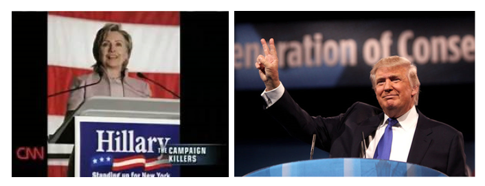
In a 2008 CNN special “The Campaign Killers” correspondent Campbell Brown said ads that distort the facts use visuals to match. And to bolster that statement, she interviewed an expert, Bill Hillsman.
Hillsman a political ad producer, revealed many of the video production tricks editors will often employ, includiong:
► drain the color from a video (leaving the picture in black-and-white) and you’ll make your opponent look bad;
► turn the action into slow-motion—which gives a sinister feel.
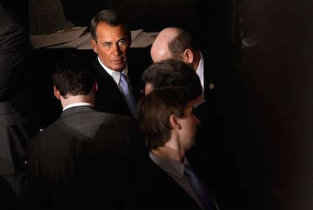
Camera angles also come into play: photographing a candidate from below will often make them look heroic (that’s Hillary Clinton from the CNN documentary, and more recently, Donald Trump speaking at a podium) while the opposite (looking down on the candidate) makes them look weak. Here’s the “up” effect.
And this image of former Speaker of the House John Boehner demonstrates the “shooting down” effect:
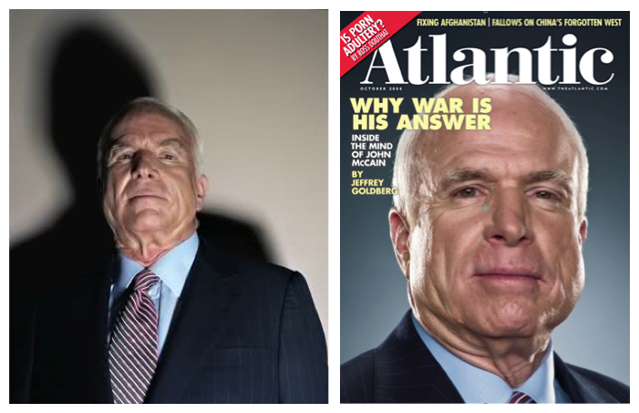
In still photographs, cropping someone’s face (and going in very close-up) can make someone appear unattractive.
Helping Students Deconstruct Political Ads
Here is a model for helping students analyze campaign ads. It was developed by University of Maryland professor John Splaine and referenced in the cable TV curriculum, View Smart To Vote Smart.
Target — who is the target audience for the spot?
Affect — how do viewers/voters respond to the ad emotionally?
Proof — was any proof offered for the claims in the ads? If so, where?
Pictures — what did the pictures convey? Images? Symbols? Do these elements work together to support the central theme of the ad?
Errors — are there omissions of fact or errors? How can you find out?
Remain — how many different images did you see, and how long did those images remain on the screen? Was the ad fast-paced or slow?
I have also developed a Political Ad Analysis Worksheet, with lots of helpful tips for students, and I invite you to download and use it in your classroom.
A Presidential Campaign for the History Books
Campaign 2016 will be one for the history books: not only will more money be spent making and broadcasting commercials for candidates, but more images and video will make their way in front of our eyeballs via mobile phones, Twitter, Facebook, Instagram and other social media.
(Video made by an instructor for a media literacy class during the 2004 presidential campaign)
As educators who wish to engage our students in critical thinking, and media and visual literacy, it is imperative we consider bringing Campaign 2016 images and video into the classroom to help students better understand poli-optics, stagecraft, and cinematic techniques.
For more ideas on the role of media in politics, be sure to see The Media Literacy Clearinghouse’s website.
______________________
Frank W. Baker’s most recent book is “Media Literacy In The K12 Classroom” (ISTE, 2012). He also authored Political Campaigns & Political Advertisements: A Media Literacy Guide, and has conducted hundreds of workshops for teachers and students around the United States. He helped write teaching standards for both English Language Arts and Visual/Performing Arts in his home state of South Carolina. He serves as a consultant to the Writing Improvement Network and to the Academy of Motion Picture Arts & Sciences. He maintains The Media Literacy Clearinghouse and tweets about media and media issues @fbaker.













Love The Campaign Killers video!