The 15-Minute Media Literacy Lesson
She admitted that it was common for her to see students for only 15 minutes at a time. How could she “do” a lesson with those time constraints? With that in mind, I offer these ideas for your consideration, whether you work in the school library space or in a classroom.
Gather up a few magazines
Does your media center collection include magazines? I’m sure it does. And many teachers also have some magazines in their classrooms. You’ve carefully chosen periodicals that will (you hope) appeal to the middle grades student.
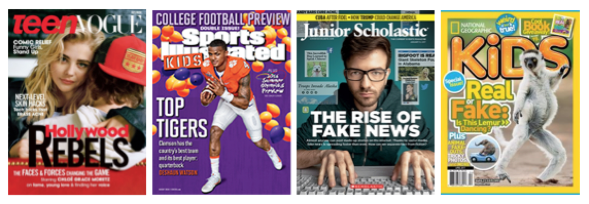
You probably have magazines created around topics of high tween and teen interest: music, sports, fashion and gaming. Perhaps your collection includes Teen Vogue, Sports Illustrated for Kids, Junior Scholastic, National Geographic’s Kids, or a host of other titles.
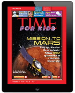
Have you ever considered using any of these readily available, student friendly magazines in a short media literacy lesson?
Asking your students to conduct a “close read” of a magazine cover is another way to teach informational texts and to get them thinking beyond the superficial. In our increasingly visual world, students should be challenged to analyze and deconstruct magazines they see at school and at home.
Some quick magazine lesson ideas
Each of the magazine covers pictured here is perfect for a short visual and media literacy lesson plan.
IDEA #1 – Why does it look like this? Visual literacy is one of the areas in which many school library media specialists already excel. Students could consider the work of the graphic designer whose job is to create a cover that will be both appealing and attractive. Have your students take notice of font size and color, as well as layout and design. (Here is a 6 minute tutorial on magazine design which you might wish to use with your students.) They’re the experts – they’re the “kids” – so ask them to find the “hooks” on the cover intended to pull them in. Do they work? Why?
IDEA #2 – Who’s the audience? What audience or audiences is the cover trying to attract? Your discussion about Teen Vogue will certainly include mentions of girls, fashion fans, but what about “rebels”? The Sports Illustrated for Kids cover promotes the College Football Preview, so sports fans, for sure. Kids interested in African American heroes? Does the picture of Clemson’s quarterback seem especially youthful?
IDEA #3 – What messages are being communicated? Every word and image on these magazine covers has been carefully considered before being placed there. Both Junior Scholastic and National Geographic for Kids feature stories about fake news. Is that messaging for adults as well as young people?
Promoting critical thinking
I’ve just scratched the surface with my examples, but I’m sure you get the idea. Magazine covers are particularly good vehicles for inviting critical thinking questions (and you can find many more via Google Images). Indeed, media and visual literacy activities in general can really open the door for this kind of deep inquiry.
For example, if you look on the back of a magazine, you’ll likely find an advertisement. Ask:
► who is the creator of the message?
► what is the purpose of the message?
► who is the audience for the message?
► what techniques are used to get and keep attention?
► who or what might be omitted and why?
► who benefits from the message?
In my 2013 MiddleWeb article, Teaching Visual Literacy With Magazines, I offered a series of other appropriate critical thinking questions with which you could engage your students. These questions are confined to just the cover image. Also see my handout for a Compare & Contrast Magazine Cover Exercise. This exercise alone could fill your limited time allotment.
And don’t just consider the magazines that interest your students personally. Think about using magazines you might have at home which appeal (obviously) to audiences outside their age range and interest. Ads for prescription drugs, common in Readers Digest and many adult lifestyle magazines, make it clear that the publication is aimed at older readers. (Also see my web page featuring past and current magazines featuring President Trump.)
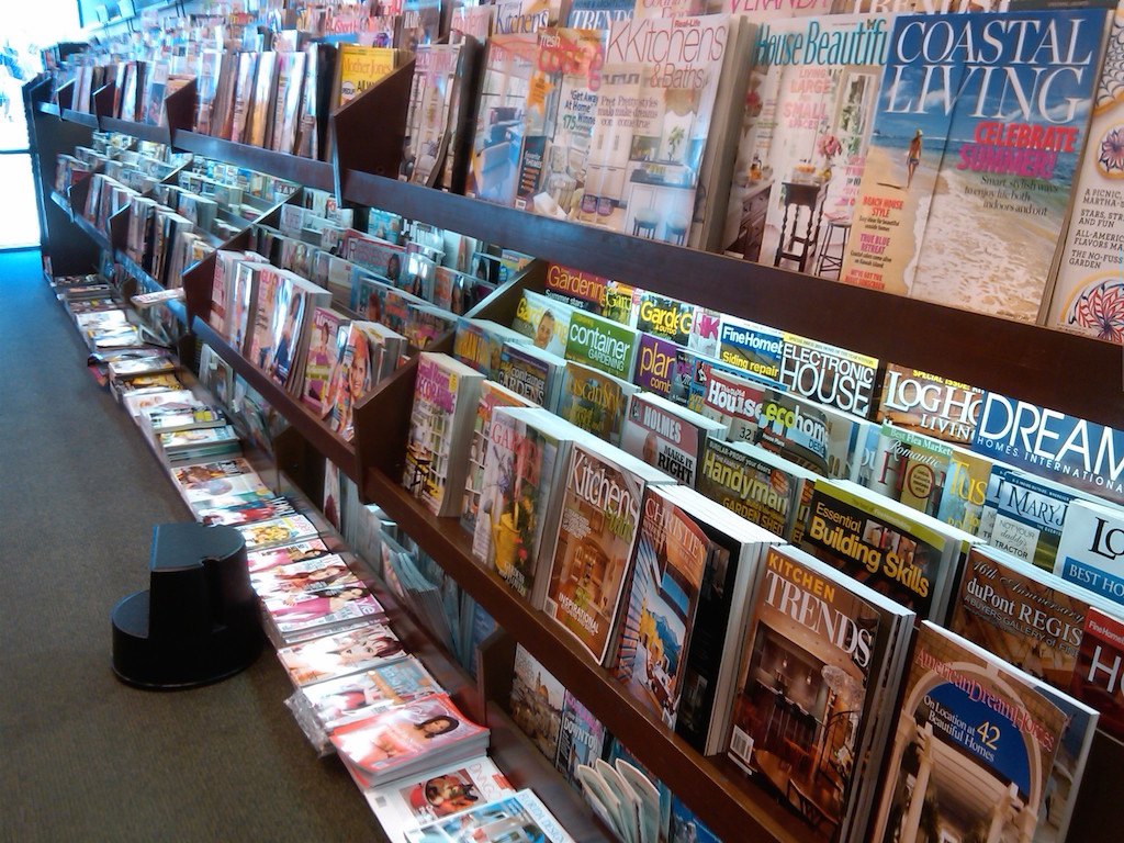
One of the goals here is to demonstrate that there are literally thousands of magazines (think of those jam-packed magazine racks at the Barnes & Noble Bookstore) aimed at informing and marketing to a variety of different people.
One more idea: Magazine economics
This idea might require several 15-minute sessions under the general theme: How do so many different magazines stay in business, and do so in the Smartphone Era, when entertaining content is just a screen away?
Profits: How does a magazine make money? Are your students aware that it is the advertising which sustains each publication? Have your students count the number of full page ads, half-page ads and quarter-page ads in a particular issue of Teen Vogue or Seventeen. How many did they come up with? (Assume each full page ad costs the advertiser $10,000, how much money did the magazine make from all of those ads?)
Circulation: You might also have your students explore the total number of readers (circulation) for any periodical. This list of the top 10 magazines in the United States (2016) might make for some interesting discussion. How many of these magazines are familiar to students? Do they read any on this list? Why might these be the biggest sellers?
Here’s a Super Resource for Planning
a Magazine Economics Lesson
Magazine Media Fact Book 2016/17
Who benefits? Another appropriate question here is: who benefits from your purchase of a magazine? (This is one of my favorite questions for students to consider.) As they begin to answer this question, consider listing their responses on a whiteboard or projection device. How many different people did they come up with? Are they surprised at the number? (Some hints: publisher, printer, writers, designers, photographers, models, graphic artists, mailing service, stores selling magazines, advertisers who convince you to buy their product, even companies that recycle paper! And they’ll think of more.)
I hope you find the suggestions and recommendations included here to be worthwhile. If you should decide to try something with your students, I’d enjoy hearing your and their reactions.





These are fantastic ideas, and once students were taught to think critically about a magazine, that thinking would transfer to online spaces. Thanks for sharing these, Frank!