Media Literacy: How To Close Read Infographics
 Do you know what an “infographic” is? Do your students? Increasingly more and more information is being conveyed in visual terms.
Infographics are visual representations of information, often using numbers and proportional data. Increasingly they also include arresting graphics that grab the attention of our image-attuned 21st century brains. They may convey a single “factoid” or an entire story narrative.
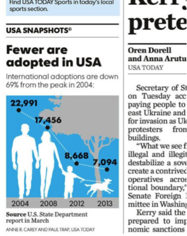
A good example of the ‘factoid” is the familiar news graphic found on the bottom left hand corner of the daily USA Today newspaper.
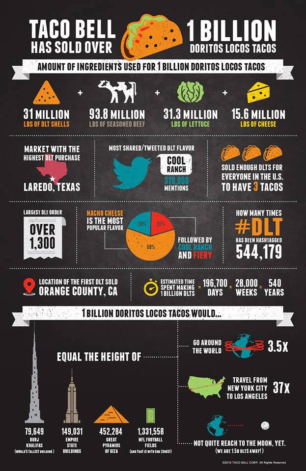
They can be used to lure customers (like this “get on the bandwagon” appeal):
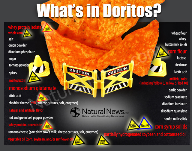
Or perhaps scare customers in another direction (like this natural health site’s attention-getter):
Why teach about infographics?
The SAT college admissions test has increased the use of graphic-type questions in both the reading and math sections. The head of the College Board justified the addition of “graphic literacy” saying “being a literate consumer of that information is valuable regardless of your career.” (Source) Here is a sample graph from a practice SAT (click to enlarge):
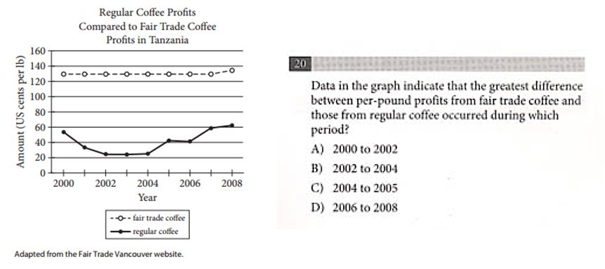
It’s easy to see how students could be disoriented if they’ve not had any prior experience analyzing and deconstructing these types of graphics or how to answer the multiple choice questions that accompanies them. The Common Core Standards for Math make reference to these visuals when they says students “represent and solve equations and inequalities graphically.” (Source)
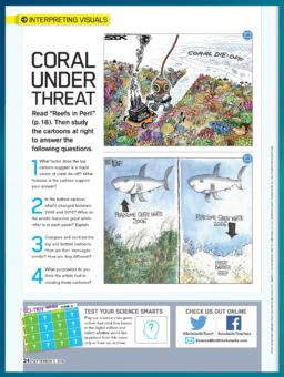
The sciences are another discipline which regularly employs infographics to explain sometimes complicated concepts, like climate change. The back page of every issue of Scholastic Science World magazine features a full page infographic. In this example, the graphic is used to coach students as they visually interpret the facts from a story inside the issue about coral reef degradation due to global climate change.
Close reading infographics
If you’ve followed my previous columns on “close reading” the media, then you’ll know that it is important for students to question how media is constructed. It is also vital to know who created the media; who is the audience; what techniques are used to make the message credible; and who or what might be omitted. These same “media literacy” critical thinking questions are also keys to understanding infographics.
Every infographic should have a central theme or idea – in other words, what is the designer or marketer trying to communicate? What are they trying to get the reader to know and to understand? Go back and look at that USA Today graphic: did you notice the headline above the image? What other words are found inside and outside the graphic – how important are they? Is there anything omitted that you’d like to know? Do you know where to go to find that information?
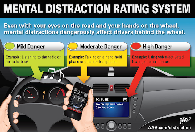
Many infographics are designed by experts who employ visual literacy and art techniques. This includes everything from the rule-of-thirds, to color, to font style and size, and layout. Infographics may convey information by using pie charts or bar charts. Or they may “invent” their own display systems. The American Automobile Association (AAA) created this infographic to capture public attention about driving distractions, including cellphones. The infographic communicates to many audiences more effectively than the original news release reporting on research by cognitive distraction expert Dr. David Strayer.
Just as in advertising, color is important in infographics. Black, for example, can signify luxury. Green often communicates nature or health. Red is thought of as the most attention-getting of all of the colors. Read more about the meanings of color here.
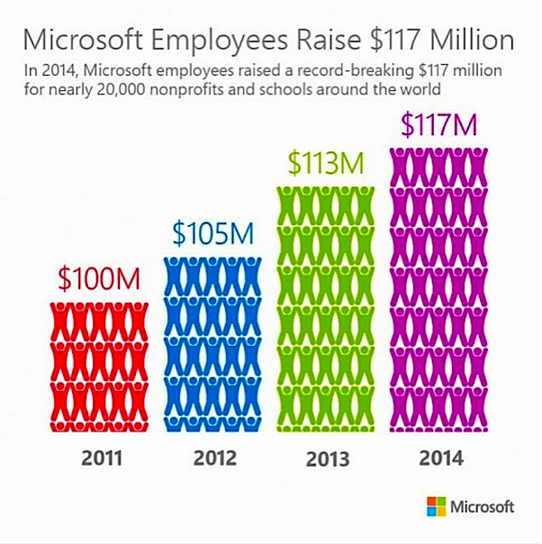
Infographics can also be misleading as evidenced by this graphic produced and distributed by Microsoft. (Source) Did you notice: the image used for 2014 contributions is double that of 2011, but the actual dollar contributions are not.
Have your students create infographics
Your students can be tasked with reading a news story, culling the important data or information from it, and creating their own infographic. What images and colors will they decide to use? How will the chosen words compliment the images? What’s the best way to explain and display the information? And how will it be informative or persuasive?
This web site lists 10 apps or software for creating free infographics.
It is clear that more information is being communicated to us visually, through the news, magazines, television and online. Already the SAT and Common Core acknowledge the importance of having today’s students be proficient in understanding graphic representations. If any of this is new to you, perhaps now is the time to determine if there are professional development opportunities that would help you better understand not only how to read visuals, but also how to implement them in your classroom.
Recommended resources
Interpreting the Data: 10 Ways To Teach Math and More With Infographics
Inventing Infographics: Visual Literacy Meets Written Content
Infographics as Creative Assessment
Why Kids Need Data Literacy, and How You Can Teach It
Frank W. Baker is a monthly contributor to Middleweb on topics related to media and media literacy. He can be reached by email at fbaker1346@gmail.com.















This strategy is good for readers of all ages. I intend to post a link to your blog for my blog readers
This is so cool