Making a Project “Pop” with One Simple Tweak
A MiddleWeb Blog
 Sometimes it’s the simplest tweaks that make a project pop – and this one turned out to be even simpler and more effective than I had envisioned.
Eighth graders at my school do an individual or partnered community impact project (CIP) each year through their science classes.
The intent is to create a measurable impact on their community, in ways as diverse as singing at a senior home, organizing a park cleanup, or running a sports clinic for kids with Down syndrome.
I feel lucky to be a part of this interdisciplinary capstone project. The CIP transfers to history class through a short research paper on the larger issues surrounding the students’ work: homelessness in the United States, for example, or refugee resettlement, or girls’ body image.
Many authentic audiences pass by the CIP trifold display boards at the STEAM and Service Fair where our students present their projects — seventh graders looking to get ideas for next year, teachers who assess for effort, and adults from the community who give awards to the most impactful projects.
But until this year, I wasn’t sure anyone was actually noticing, let alone reading, the 300-word research summary. Even though students presented it neatly on one page, nothing beyond serious curiosity or a relationship to the student compelled people to linger.
I was frustrated by all of this effort going essentially nowhere.
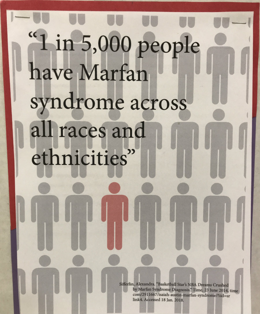
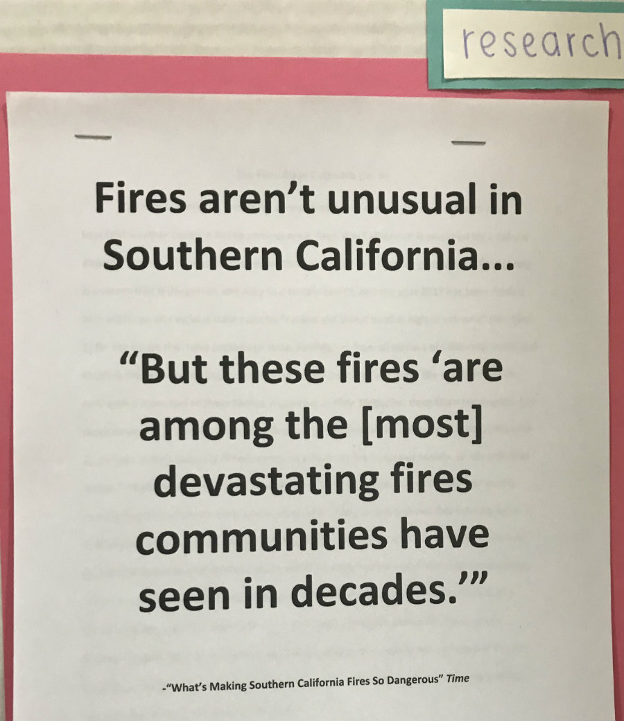
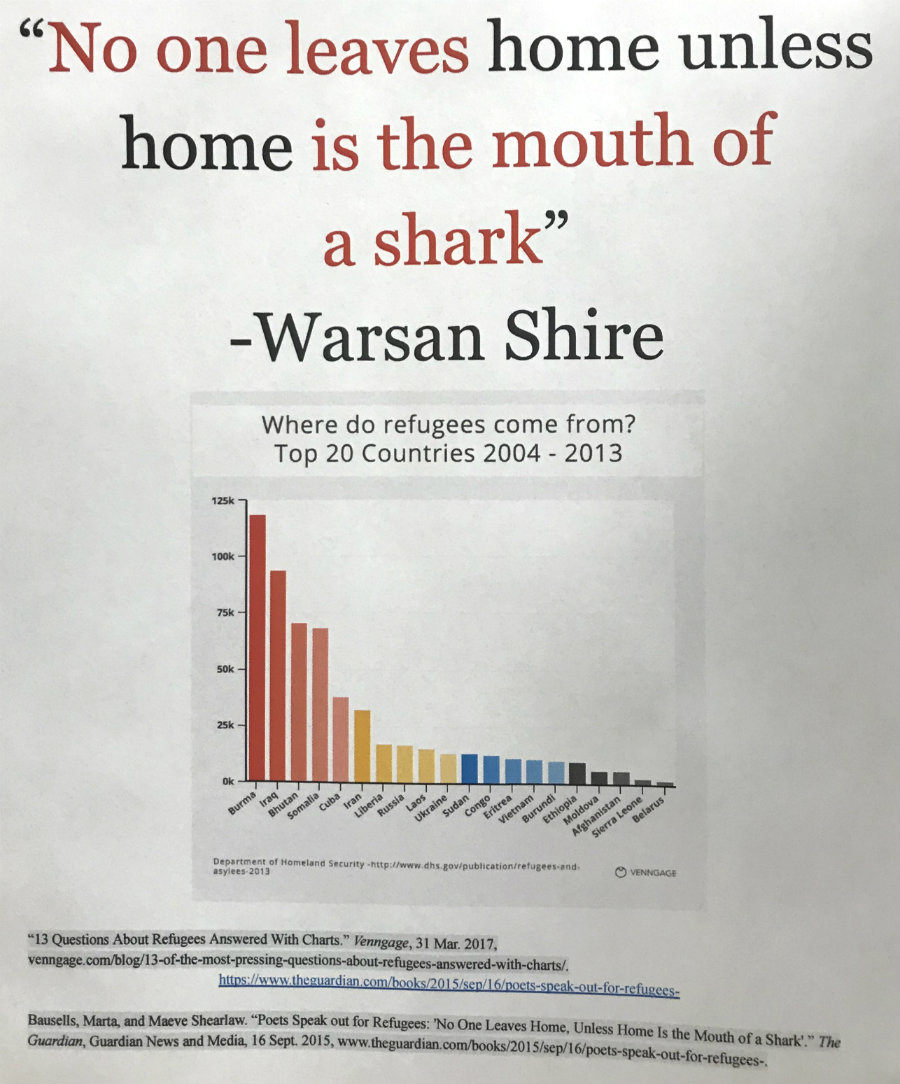
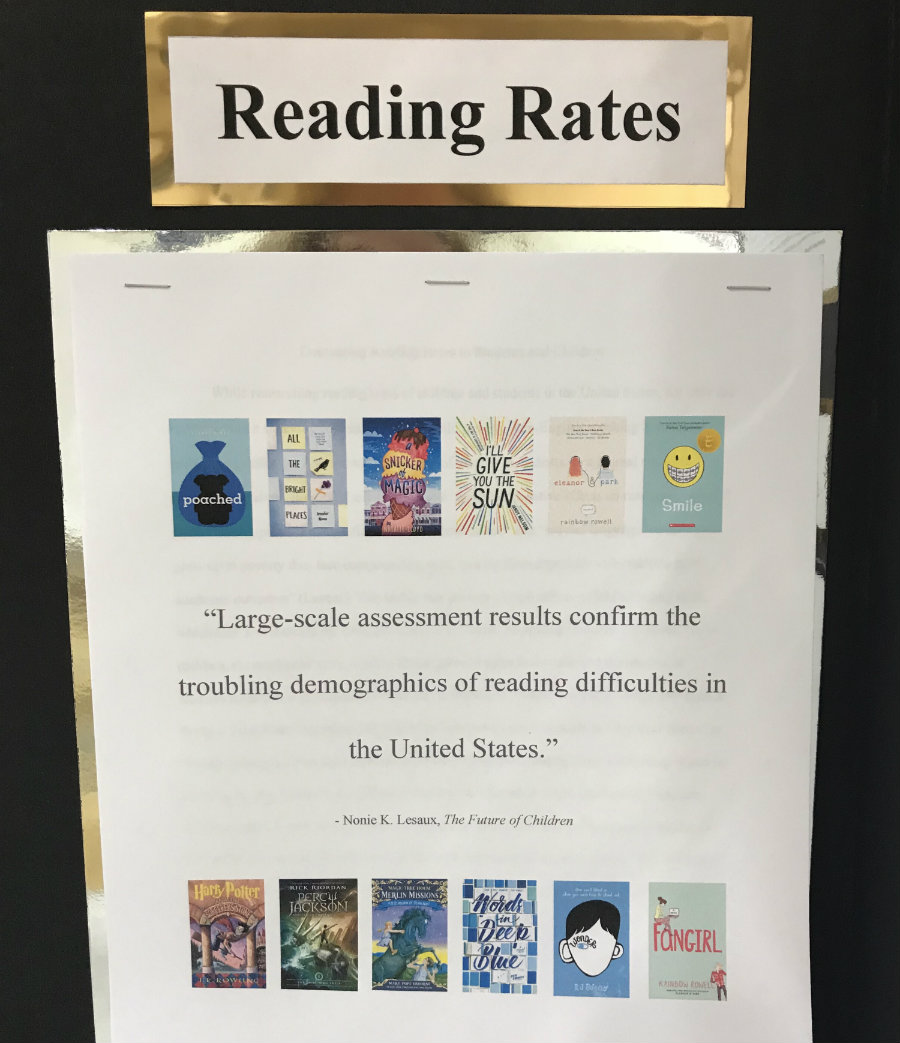
So this year, I asked students to add one attention-grabbing element to their boards, stapled on top of the research paper and bibliography.
A quotation. With brief citation. In big print.
That’s it: one quote, writ large. And it made a huge difference.
The visual impact brightened the board and choosing the quotations made the students more invested in their research. Even other teachers commented on how compelling the excerpts were to read.
As a bonus, some students bedazzled their quotes with apps they hadn’t necessarily used before, such as Piktochart.
- An accomplished musician, Alex wrote: “6 million children in the U.S. have no exposure to any form of arts in school,” from an L.A. Times article highlighting the power of arts education.
- For a Little League fundraiser, Josh picked a quotation from Disabled Sports USA that asserted: “More than half (56%) of physically active adults with disabilities believe being physically active has helped them gain an increase in their responsibilities in the workplace.”
- And Nicole, for a project on minimalist consumerism, referred to a Psychology Today article that quoted Affluenza: The All-Consuming Epidemic, to point out that Americans tend to “spend more on shoes, jewelry, and watches…than on higher education.”
One major goal for next year is to routinely ask myself: How can I make this project, lesson or assignment more visual? For my students’ engagement as well as my own.
What have you done with text in projects to make it pop?
__________________________________________________
