Remote Teaching with Engaging Infographics
A MiddleWeb Blog
 Most teachers, like myself, have made a huge shift to teaching remotely in their states. Trying to balance the teaching of our own children and our students, while creating engaging lessons, can be challenging.
More specifically, subjects such as science (I teach both ELA and science) can leave us scratching our heads when trying to figure out how to get certain science concepts to stick with students.
Short of turning our own kitchens into science labs, it can be almost impossible.
Educators know we encounter many different types of learners in our classroom. Science class affords us the opportunity to meet the needs of hands-on, auditory, and visual learners. As we are faced with the task of teaching remotely, connecting with these types of learners is vital to our success.
One significant challenge familiar to all science teachers is getting students to understand data that is placed in front of them. Students often struggle with looking at different data sets and trying to make comparisons and interpretations.
My solution? Infographics. Infographics has been a great way for me to engage my students with data and encourage them to apply creative as well as critical thinking. And with the shift to online learning, I’m finding infographics more useful than ever.
What Are Infographics?
Infographics are visual representations of data that are meant to display information in a quick and easy way for clear interpretation. They are very beneficial for visual learners.
Over the years, especially with the rise of social media, infographics have become more and more popular thanks to their visual appeal. A good infographic provides information about something specific (it’s not too broad) and for a specific purpose (it’s part of a larger learning experience). Here’s an example:
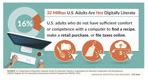
Appealing Infographics
For infographics to work for students, or anyone else, they should have a compelling story, offer reliable data, be aesthetically pleasing, and be easy to share. Our goal should be to keep it simple when it comes to infographics.
As both a science and English teacher, I approach infographics as a form of writing when it comes to having students create them. A great resource for teachers looking for appealing infographics is Kelly Turner’s “Graph of the Week.” Another quick way to find infographics is to do a simple image search that includes your keyword plus the word “infographic.”
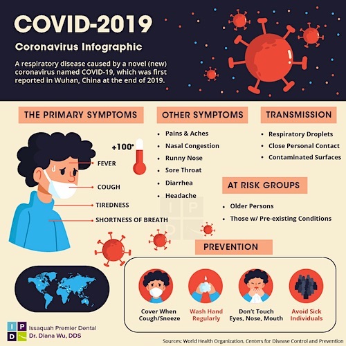
Source: Issaquah Premier Dental
For example, if during a discussion of the spread of infectious disease I want my science students to visualize the threat posed by the Covid-19 virus, I might search Google Images for “Covid-19 infographic” and choose from a huge selection, checking for reliability, clarity, and visual engagement.
Teaching with Infographics
As teachers think about creative ways to reach students during remote teaching, one aspect to consider is devoting time to having students analyze and create their own graph. For me, I can see infographics covering two content areas: English and science.
For some, it could be a daily “warm-up” activity as you start a Google Meet or Zoom call. In my classes, I have been starting out with maps, then using graphs, and then moving up to Infographics. By scaffolding the process, students don’t feel so overwhelmed if they are seeing an infographic for the first time.
A simple warm-up and conversation can be very beneficial and helpful. However, infographics allow viewers to dig deeper, and it can lead to engaging conversations. To help students dive in further, I give them an infographic and ask the following questions:
- What “story” is the data trying to tell us? Is the story compelling?
- Why do you think the images are used to represent the data?
- Is the infographic the best representation of the data?
- Who is the person, people, or organization that created the graphic?
- Do the images work for this particular representation?
- What more can you see?
As students explore these questions, it is important to note that I want students to make connections to the information personally and to the real world. Yes, this can be particularly difficult for students who have never been asked to do this before. With remote learning, I feel it would be beneficial to send out the same infographic to students 1-2 days before having a live discussion with them on Zoom or Google Meet. This would give them time to process and give more thoughtful answers.
Another lesson I use when helping introduce students to infographics is called “Using Graphs for Writing-to-Learn.” This strategy was originally designed by Kathy Kurtze, a Chippewa River Writing Project colleague, and has since been adapted by my co-author, colleague, and friend Troy Hicks. For my class, I have adapted it further. You can find a template for this lesson below. It is also available on my website. I’ve included links to some favorite apps for infographics creation.
When there is a sense that students have a good grasp of what infographics are trying to show data wise, it is then they can explore how to make their own. When we think about students creating infographics, we want them to understand that it isn’t simply about making a graph or a chart. It’s a representation of data that draws the viewer in and tells a story, however brief.
Any graphics that students choose should help represent data accurately, and they shouldn’t just choose pictures because they think they are cool.
For more tips on using infographics with students,
see this MiddleWeb post by Sunday Cummins
Final Thoughts
Yes, we can have students turn pages in a magazine or have them click on a link we provide for them to see infographics. Although they are designed to relay certain information clearly and quickly, the question can still lurk on whether they can help advance student learning.
For me as a science and English teacher, students can use infographics to represent data they gather in labs and doing comparative analysis. For instance, in our current climate, while students try to wrap their heads around the novel coronavirus, they could compare data between states or countries in relation to deaths or survival rates. A social studies teacher might use an infographic to help students consider the impact of known pandemics on humanity over recorded history.
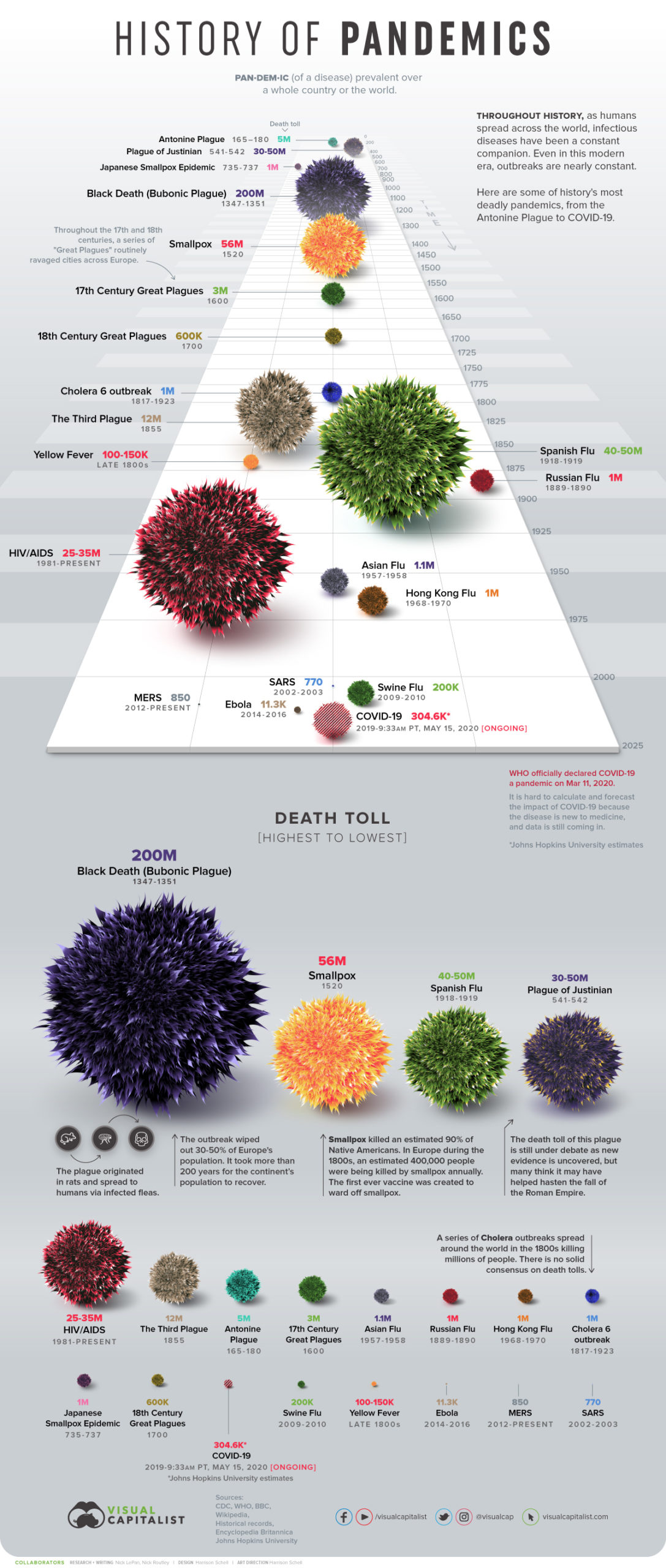
Source – The Visual Capitalist
From an English teacher’s perspective, infographics can open the door for students to be creative with their writing as they include graphs, pictures, and charts. Furthermore, students will start thinking more about audience and what message they are trying to relay to individuals or groups. They can learn something about writing efficiently, using the fewest words possible to convey the most information.
I like the reach of infographics and their potential to differentiate. If teachers choose to implement infographics into their own curriculum and instruction, they can help all types of learners, especially those that learn best when they can visualize the content.















Completely agree, like me that I have trouble to concentrate in reading
is very good
The use of graphics, images, videos, etc. In teaching within classrooms, it allows linking the literal knowledge learned with the environment that surrounds the student and therefore the assimilation of knowledge.
el uso de graficospermite al alumno una captacion mas rapida de lo que o se esta planteando o impartiendo
el contenido escrito deja muy buena ensenaza y muy practico para hacerlo y aprenderlo facilmente
Es verdad, los maestros cada dia necesitamos mas de la tecnologia para poder impartir nuestras clases.
En estos tiempos de pandemia, necesitamos estar al dia con la forma de interactuar con nuestros estudiantes.
Por eso la importancia de capacitarnos dia a dia.