Picturing the Pandemic: Helping Kids See More
A MiddleWeb Blog
Many of us have already seen media images of people wearing masks; interviews with doctors and other medical professionals; people working in labs to produce a virus vaccine, and sometimes, patients in hospital beds.
“How we think about the pandemic depends on the news sources we follow.” That’s the way Sirius-XM talk show host and well-known centrist Michael Smerconish described things during a recent broadcast on the satellite radio channel POTUS.
How we understand our world depends in a large part on our exposure to it and how the media represents it. If students only see one body image held up as the ideal, for example, they might think that image is the only one to be valued. If their understanding of Africa comes only from watching nature documentaries featuring lions, giraffes and rhinos, they might believe that all of Africa appears that way.
Oftentimes, stereotypical depictions in media lead many people to a skewed and erroneous impression of their world. And this is certainly true for teens and tweens who often live in an age-group ‘bubble.’ How can we help them expand their understanding?
The 8 x 10 Media Literacy Tool
In this previous MiddleWeb column, I referenced how magazines – those at school and elsewhere – can be used to engage students in visual and media literacy skills.
Every week or so, news magazine cover designers go to work to produce an 8×10 image that distills and communicates a theme editors have decided is important. The creativity of the design also encourages people to buy the magazine. The same is true for monthly magazines that focus on current issues and events.
What the Covers Tell Us about COVID
How has the pandemic been presented to us and our students? With that question in mind, I embarked on creating a new media/visual literacy resource that teachers could use in classrooms and virtual settings.
In March of this year, with the pandemic dominating the news, I began snagging magazine covers from the internet for a new website that is a now a comprehensive database of hundreds of pandemic-related covers from the United States and around the world. You may be surprised at the scope of covers representing every possible genre and area.
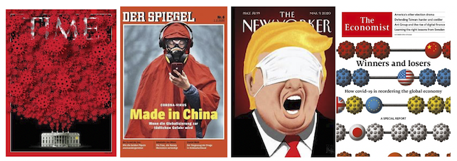
This past May, I was joined by media literacy colleague Renee Hobbs in a webinar where we introduced the database to educators. We created a visual and media literacy index for students to use as their guide to analyzing each publication.
During the event, we utilized MURAL software which made commenting on covers user-friendly. Participants could easily drag “sticky notes” adjacent to a cover they wanted to comment on.
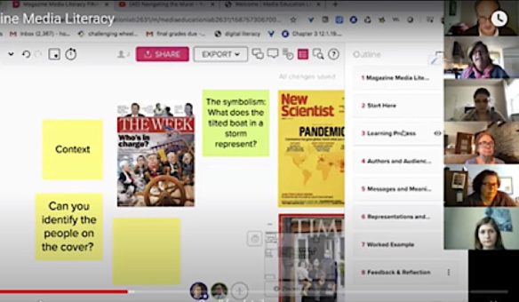
A screen grab from our May webinar showing how participants engage with an interactive board to analyze covers.
In the months since, more teachers have begun to use Google’s Jamboard app, which offers similar options.
Engaging Students in Magazine Covers
In a two-day middle school workshop I conducted a few years back, I challenged art students to analyze the creative techniques graphic designers use.
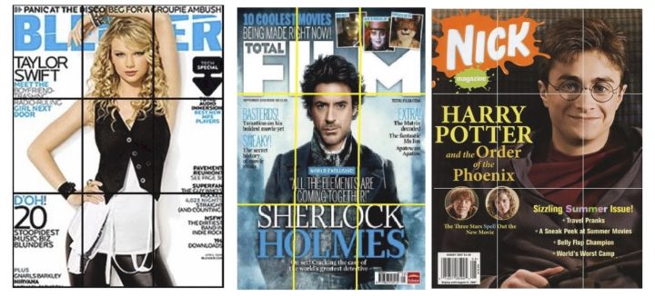
On the first day, each student was assigned a magazine (most of which fell outside their reading interest). I explained the role of the graphic designer and called attention to the techniques they use including layout, color, font and more. I also introduced the “rule of thirds” and how designers use it to draw our eyes to specific points on the page.
As I began to introduce the concept of media literacy, I asked students to consider the demographic (the target audience the publication might be trying to reach). Many students were baffled – they weren’t sure how to identify who would be most likely to read a particular magazine (imagine AARP vs Nick vs Field & Stream, etc.).
I suggested they open the magazine and sample some of the ads. Once students identified what products were being advertised, they began to get clues about audience demographics.
On the second day, students joined me in the media center where magazine cover template software had been preloaded onto computers. Each student was challenged to create a cover similar to the magazine they’d been assigned.
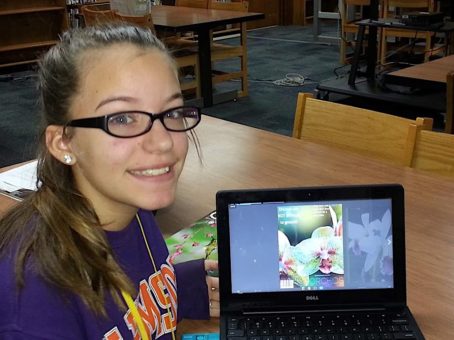
A middle school student shows off her cover creation – a reworking of Orchid Magazine (click to enlarge).
This activity was most engaging as students had to first locate an appropriate vertical image for their cover. After loading it into the software, they selected a font to resemble the real magazine title; and decided on words or phrases that might make the audience want to pick up the magazine and purchase it.
Sample Deconstruction of a Cover
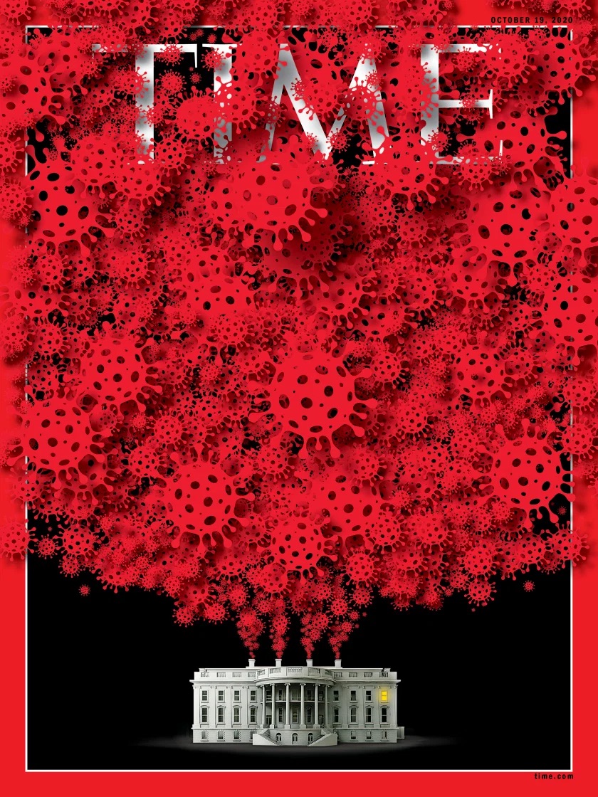
Below is a TIME magazine cover released in early October, during the period when President Trump’s COVID infection was announced. When we “close read” a cover, we are examining the image, but context is also important. You may remember that President Trump returned to the White House after a weekend hospital stay. The news that week was full of stories about others in the President’s circle who were also infected or at significant risk.
► A teacher might start by asking: What do you know about TIME magazine. (It’s a weekly periodical that covers national and international news.)
► Second you might ask: What do you think is happening in this cover image? (The White House is shown centered at the bottom of the page, with what looks like smokestacks at the top pouring out red ‘smoke.’)
► Next: what might the red circles represent? And why do they originate from the White House? (Students may recognize the widely published facsimile of a COVID-19 virus ‘ball.’)
► Lastly: What might the graphic designer be trying to communicate with this cover? What might it mean? (Some students may be aware of criticism that White House staff and visitors didn’t always follow safety protocols.)
Creating A Cover
If you have time and resources, you can engage students in doing their own magazine cover design. See the recommended resources below for more information. More informally, you might ask your students:
If you were going to create a magazine cover about Covid-19…
• what images and words might you use?
• who might be the audience for your magazine? What do you want to convey to them?
• what techniques will make your audience want to pick up and read your magazine?
• how will you market your magazine? What medium will get the most eyeballs? (Online store, social media, radio, television, print)
Media and Visual Literacy Skills
It’s clear: we need to spend more time helping our students develop their visual literacy and media literacy skills. They are exposed to media messages non-stop, in social media and elsewhere.
When we find time in our busy school day to introduce a current event text, like a magazine cover, we’re actually helping students understand how images are used to communicate, and even manipulate. We also help them to understand and appreciate the role of graphic designers who utilize creative techniques in their magazine cover creations.
I hope this blog post gives you some ideas on how to engage your students. If you do use this idea, or one of your own, I’d love to hear from you. Send me an email: fbaker1346@gmail.com
Recommended Resources
Magazine Media Literacy in a Time of Coronavirus – My colleague Renee Hobbs has created this useful page at the Media Education Lab with more specifics about engaging students in creating their own covers – including the Mural app and a companion template.
Our October Webinar on Magazine Covers – This archive of a 2020 hour-long Zoom session features Renee Hobbs, Sarah Clapp and me discussing these ideas with teachers – in this case a model lesson demonstrating how to apply key concepts of media literacy to images of the Trump Presidency.
Our recent free webinar for teachers
Pandemic Magazine Covers – Frank Baker collection
Magazine Cover Analysis (video tutorial)
Magazine Cover Rubric (ReadWriteThink)
10 Golden Rules of Magazine Cover Design
US Magazine Industry – Statistics & Facts
Togethering: Picturing the COVID-19 Pandemic (photo exhibition)
World Photography Day 2020: Picturing The Pandemic

He maintains the popular Media Literacy Clearinghouse website of education resources. His most recent book is Close Reading The Media, a publishing collaboration between MiddleWeb and Routledge Eye On Education.
