Using Google Sheets to Track Student Data
Using Google Sheets is an efficient way to keep track of student data, as well as to meet other progress monitoring needs.
Once the initial set up and formatting are completed, you will find many uses for this quick data check that will more than justify your time investment. This can include creating groups, scheduling student conferences, identifying intervention or acceleration needs, and parent communication.
There are many ways to individualize this resource to your needs simply by following a series of steps. Once you create a Google Sheet and begin using it, you will most likely find other ways to use this method for other tracking purposes.
Decide what you want to track
First, decide on what you will be tracking. Create a header that includes a column for student names, and then columns for the various assessments or areas you want to track. Simply type across the sheet in each of the cells.
Once this is done, you can make aesthetic changes such as font by clicking the “Select All” box, which is the white box (upper left corner) above the numbers column. This will ensure that any items made will now appear on the sheet. You can also make sure the text in each cell is easily read by clicking the “Select All” box so when you make an adjustment to one cell using the dragline to adjust the column size, it will apply to all. This creates a pleasing presentation across the sheet.
To align the text in each cell, click on the whole row. Go up to the toolbar and click on the “Text Alignment” option. Next, choose “Center Align.” All cells will now show each heading centered. To make the header space bigger, drag the border line under the number column down. This causes the text to be on the bottom of the cell.
To center the text in the cell, you can go up to the toolbar and choose the “Vertically Align” button, which will give you some choices. Choose the center align button. Once this is done, all text will be centered in the cell.
Another option is to make your text vertically aligned rather than horizontally aligned. This can be done by clicking on the row again, then going to the “text rotation” button in the toolbar above. Select “Rotate Up.” Doing this step will create the need to drag down the border line to ensure all text is easily read in the cell.
Student names will be entered in column A, and it is important that you can still read the header with column names when scrolling down. In order to keep the header from moving, click on the header row, click on “View,” then “Freeze” and click on “1 row.” Now the header will stay fixed in place when moving from student to student.
Think about how you’ll input data
In my example, I have decided to create a drop down box for the cells that contain assessment data. To do this, click on the cell, go up to the toolbar and select “Data”and scroll down to “Data Validation.” Then change data validation from “List from a range” to “List of items.” Then type in the different assessment results that you want, such as “Above, On, Below” – referring to grade level progress.
Be careful not to use the same words in different descriptors as later this could be problematic when formatting with color. I chose not to include the words “grade level” in my descriptors as it created a problem in formatting later.
Once done, click “save” and you will see that a drop down menu has been created in that cell. To be able to use through the entire column, drag down the edge of the cell which will copy and paste the formatting down that column, and then drag to the right across and down again to copy and paste the formatting across all the cells where you want to input this data point on the sheet.
Colorizing your data
Once you have input all of your data, I have found this sheet to be easier to read and much more efficient when I colorize the data points from the drop down menu. Colorizing helps to show at a glance which students may need acceleration, intervention, or help to create groups for optimal peer to peer learning.
To do this, simply highlight all of the cells containing data, go to the toolbar and select “Format.” Next, scroll down the format menu and select “Conditional Formatting” where a conditional format rules menu will open up on the right side of your screen. Then, scroll down to “Formatting Rules” and using the drop down menu, select “Text Contains.” Type in the first assessment result title you chose to use (ex: Above, On, Below, etc.) and then click on the fill color option icon (the tilted cup) to change to your selected color.
Now you should see all of the assessment results in your chosen color on your sheet. Continue changing the other results by clicking on “add new rule” until you are done. Below is a mock example of using colored data points:
The remaining two areas on my spreadsheet, “Student Conference” and “Contact Parents,” need another quick way to make a notation. Again, this sheet is an “at a glance” resource to provide necessary data and information.
I have found creating a quick check box to be the optimal way to keep track of these two areas. To do this, highlight the cells in the two columns, go to “insert,” go down to “Checkbox,” and click. Checkboxes will automatically be inserted into the highlighted cells. Now I simply check if I’ve had a student conference and/or have contacted the parents.
Adding color increases functionality
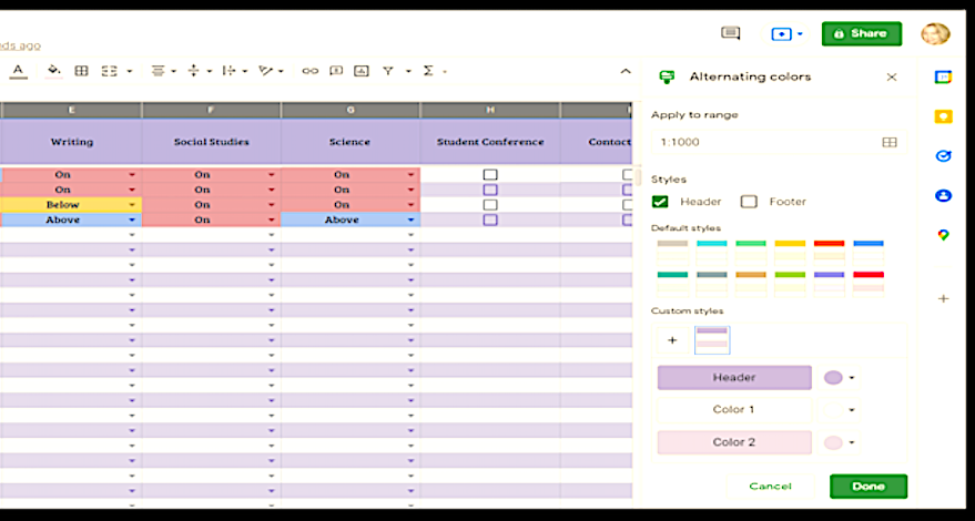
I like to make my spreadsheets visually appealing and as easy to read as possible. While at a meeting or in a conference, I find using alternate colors for rows helps me locate student information quickly.
To do this, first click on the “Select All Box” (the white box above the number column) so that the sheet is completely highlighted. Then, go to the toolbar and select “Format,” then scroll down to “Alternating Colors.”
A menu comes up on the right side of the screen where you can choose color combinations that will change both the header and alternate the color of the rows.
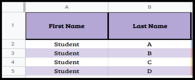
To make the information on the header stand out more, simply click on the header row to highlight all the information and select “B” from the toolbar to make all of the text appear bold. Another nice option is to go to the toolbar and select the “Border” option. You can choose the color as well as the thickness of the border line. By simply selecting the “Names” column, you can follow the same instructions to bold the text and add a border.
There are also options for how you would like to organize the “Names” column. You can simply type in the first and last name of each student. To create a separate column for first and last name, right click on that column (most likely column A) and choose “Insert 1 right.”
Then, click on the column with student names, go to the toolbar, and click on “Data.” Scroll down to “Split Text To Columns.” Next, a separator menu will show up and you’ll change from “Detect Automatically” to “Space.” Once this is done, the sheet will automatically detect the space and split the names into the right column. Simply go back and type in First name and last name on the header rather than “Student Names.”
A few final Google Sheet tips
If you are looking to see how students did with a certain assessment, this can easily be sorted. Click on the assessment column, scroll down to “Sort A-Z.” When looking at a particular assessment, you can sort the results to show on the sheet by clicking on the column, then click on “Sort column from A-Z,” and now you can see what group.
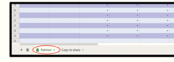
If you would like to share this sheet with another colleague, you can do so without anyone changing your data. What you will actually be sharing is the format and setup of the sheet, not your data. Scroll down to the “Sheet 1” tab at the bottom of the sheet. Label it with your name, then click “duplicate.” Now, go into the copy of your sheet and delete all of your data. The sheet can now be shared as well as used by another person with the formatting still in place.
Data is powerful
Using a Google Sheet saves a lot of paperwork and makes data extremely accessible at a meeting or conference simply by using a Chromebook or smartphone. This is definitely a time saver as well as a great way to track student progress.
I will be teaching my students how to create their own Data Trackers, which will share some responsibility to my students for tracking their progress as well as taking ownership of their learning. Data is powerful and can help us in our teaching as well as help our students continue to grow as learners.
Kathleen Palmieri is a National Board Certified Teacher and NBCT Professional Learning facilitator. She is a fifth grade educator in upstate New York who reviews and contributes regularly for MiddleWeb. With a passion for literacy and learning in the classroom, she participates in various writing workshops, curriculum writing endeavors, new teacher induction development, and math presentations.
As a lifelong learner, she is an avid reader and researcher of educational practices and techniques. Collaborating with colleagues and globally on Twitter @Kathie042500 and expanding her education adventures at www.kathleenpalmieri.com are her ongoing practices.


