Teach Visual Literacy with Popular Magazines
For more than a year, I’ve been using popular culture and in-school magazines as part of my media literacy workshops.
We all have magazines at home and at school. They have a high student engagement factor in the classroom and are proving to be a very effective way to teach visual literacy, media literacy, and a host of Common Core standards.
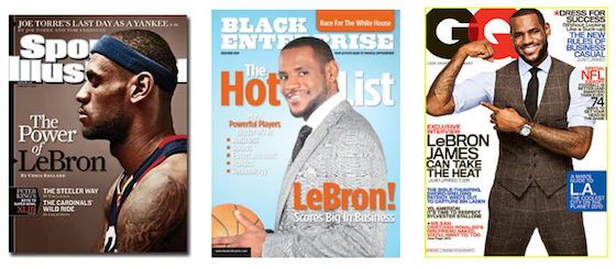
It all started for me when NBA basketball player LeBron James adorned the cover of several magazines, published within weeks or months of each other.
Using Google’s image search function, it was easy to locate and download cover images for the activity I planned with a large group of teachers. I created a one-page handout, which you can find here. (I have since revised this activity, using cover images of actress Jennifer Lawrence.) It seems every week, some celebrity is featured on more than one magazine. So this activity can easily be updated.
Here’s the trio I chose:
Once I selected these three images, I began to consider the kinds of questions I wanted educators (or students) to think about when analyzing and deconstructing the covers.
Students as Detectives
Much has been written recently about students becoming “detectives” (example), and part of this investigative work means knowing what questions to ask. The new Common Core standards emphasize “close reading” analysis, with the emphasis being on student observation (what do you see?) and evidence (what in the text makes you think that?).
Similarly, both media and visual literacy encourage critical inquiry. Visual literacy is also quite evident in CCS-English Language Arts in grades 2-6.
So the questions I posed and posted under the three LeBron covers were:
1. Who is the audience for each magazine? What are the clues?
Every magazine targets a specific group of people. In the ad business, it’s known as demographics. If students are unfamiliar with the exact target audience of a periodical, they can certainly begin to study the types of ads and products contained in the magazine and make some educated guesses. The bits of “teaser” text on the covers also offer clues about the audience editors and publishers are trying to hook.
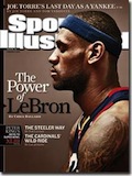
This is relatively easy for most covers. In the LeBron examples, he looks much more serious (his “game face”) on the Sports Illlustrated cover than he does on either Black Enterprise or Gentleman’s Quarterly. Students can be prompted to explain why they believe each magazine chose the particular “look” they did.
3. Magazine covers are also considered advertisements. What techniques does each of the publications use to sell themselves to their readers?
I’m not sure how many teachers even approach teaching covers as advertisements for a product (the magazine itself), nor how many students ever consider this question. But let’s be honest: magazine covers are ads that, if done well, lure us in. They use specific techniques (layout, color, font size, images and more) to get us to pick them up whether we’re in the checkout line at the grocery store or just browsing at the local Barnes & Noble bookstore.
Covers may even be considered informational texts, with headlines and other details designed to engage the reader. Of course, the ultimate purpose of the cover is to get the consumer to purchase it, so the entire cover might also be considered a persuasive text. A good follow-up question here might be: what on the cover makes you want to buy it?

Imagine you’re the photographer responsible for taking the shot that’s going to grace the cover of each of these magazines. How will you position the subject and what expression do you want him to convey to the reader? Since students rarely study expression (outside of drama or public speaking), this is another opportunity for the teacher to call attention to the importance of expression in communication. How different is his smile or the cast of his eyes on the fashion cover and the business cover, for example?
5. If you could read only one of these publications, which would it be and why? In other words, which is most appealing?
Ok, here’s five dollars. Which magazine are you going to purchase and why? What do you hope to gain by reading the magazine you chose? Why did you choose one over the others? What demographic are you a part of?
Extending the Activity
Here’s one additional critical thinking activity I would like to suggest. Pose this question to students: Who benefits from your purchase of a magazine? Students should brainstorm, creating a long list of people and companies that benefit from magazine purchases. Obviously, many people, beyond the advertisers themselves and the store, benefit. (For example, does the National Basketball Association benefit from Sports Illustrated?)
Students might also consider Media Literacy Core Concept #1 – “All media messages are constructed,” followed by the key questions: “How was this created? Who made this message?” ( in this case the magazine).
Graphic design understanding comes into play here, as each publication employs artists and designers to use techniques sure to appeal to the reader. Students will also have to dive deep into a magazine to determine what company is responsible for creating the magazine. The largest companies, like Conde Nast, publish magazines for widely varied demographic/interest groups. (The remaining media literacy concepts and questions should also be used here.)
Some Final Thoughts
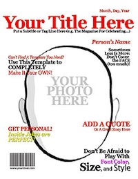
After students have analyzed magazines, you might give them opportunities to create their own magazine cover. Just Googling the phrase “create your own magazine cover” brings up a host of websites available for you to consider using with your students.
Using magazines to teach Common Core standards is another way of reaching your students, especially those considered “at risk.” When you introduce a cover featuring someone they instantly recognize (e.g. singer, movie star, celebrity, sports figure) your students are more likely to be engaged and want to tell you what they know about the subject. So, you’ll be opening the door to meeting them where they are.
__________
Frank W. Baker is a media literacy education consultant and the author of three books, including Media Literacy In the K-12 Classroom (ISTE, 2012). He contributed two chapters to the upcoming Mastering Media Literacy (Solution Tree, December 2013). Baker maintains the Media Literacy Clearinghouse website and conducts media literacy workshops at conferences, schools and districts across the United States. He can be reached at fbaker1346@aol.com. Follow him on Twitter @fbaker.










I’m taking a course that outlines the six language arts (listening, talking, reading, writing, viewing and visually representing). As part of the assignment, I was asked to search from a list of topics and I chose “common core” because it is a very hot topic in our schools daily. I was pleasantly surprised to find your article related to use of magazines in the classroom and how each lesson corresponds to common core standards and the expectation of extended thinking. However, as I read further, I realized that these unique lessons ALSO support the six language arts that I am studying. Thank you for the excellent resource. I will be incorporating this idea in the near future as part of my “sneaky” teacher plan to get reluctant readers in middle school interested in reading more often.
Thank you so much for sharing your ideas and resources!
Thank you so much for this article. Great for engaging students!